
At the Albertina Modern, a new exhibition highlights the evolution of print techniques, and how artists experimented with this after 1945. In “ANDY WARHOL TO DAMIEN HIRST – THE REVOLUTION IN PRINTMAKING”, visitors can admire a diverse selection of large scale works from the museum´s collection of printed graphics after 1945. Among them are artworks by such well-known artists as Andy Warhol, Roy Lichtenstein, or Kiki Smith, and also some contemporary art positions by Austrian artists. I had a chance to visit the exhibition with a bunch of like-minded photographers with Instagramers Austria and Instagramers Vienna last night.

Isn’t life a series of images that change as they repeat themselves?
Andy Warhol
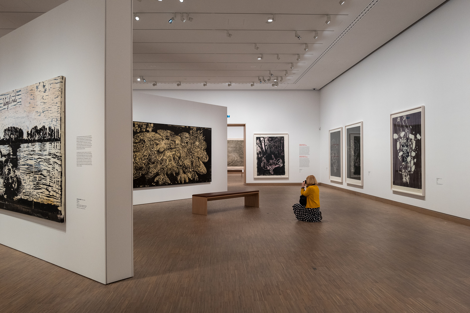
The ALBERTINA Museum’s collection of printed graphics is reflective of important post-1945 phenomena and international developments in the art world. The collection includes outstanding examples of American pop and minimal art. German artists are also comprehensively represented by Georg Baselitz, Jörg Immendorff, and Anselm Kiefer, as well as contemporary Austrian artists. The exhibition focuses on different print techniques, showcasing traditional techniques such as woodcut alongside innovative works that utilize alternative printing technologies.
Andy Warhol, famous for his pop art, liked the process of printing a lot. It enabled him to repeat a basic image in many variations, simply by printing it in different colours or by adding paint to the printed image. One well-known example is his series of the Mao portrait.

The exhibition includes approximately 70 key works of post-1945 art history, some of them in large formats. These works embody the principal elements of the ALBERTINA Museum’s present-day collection, highlighting the museum’s commitment to collecting and showcasing contemporary and innovative works of printed graphics. If you like popping colours, this one´s for you! But of course, the exhibition goes well beyond pop-art.


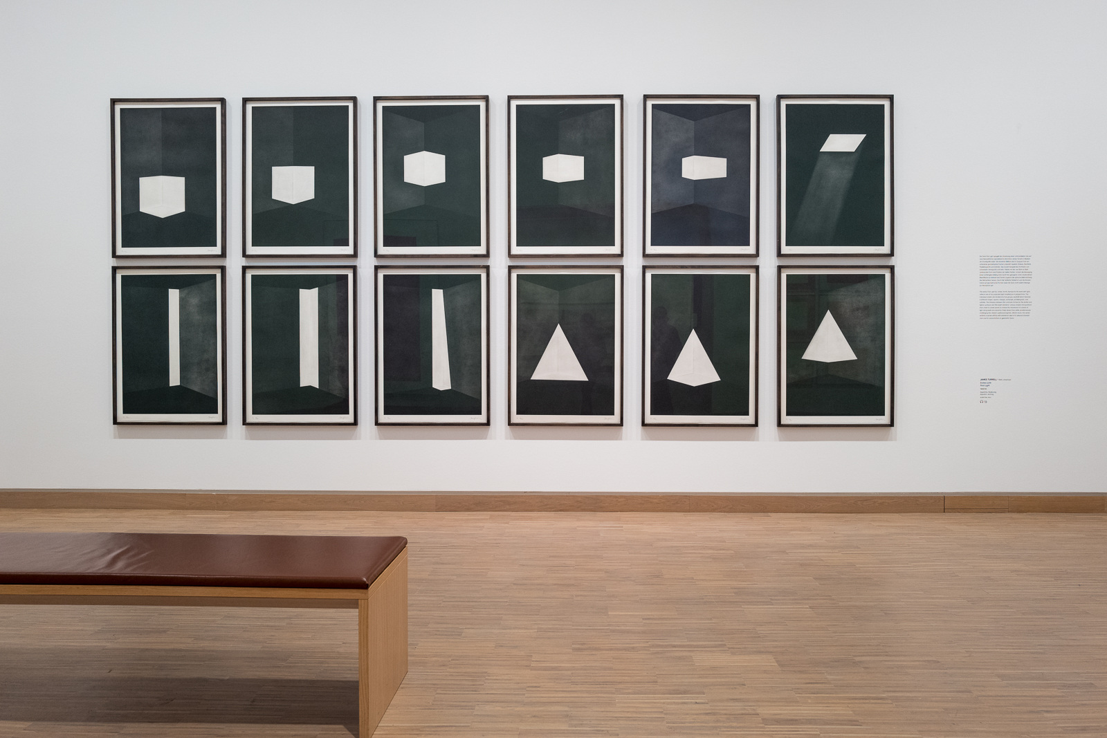
But not everything in this exhibition is so colourful, many of the works are monochromatic with a strong focus on graphic elements. For example, the “First Light” print series (see in the gallery below) is a set of etchings created by James Turrell in 1989. The prints were created using a technique known as aquatint etching, which involves creating a textured surface on the printing plate using a fine dust of resin or powder. The plate is then immersed in an acid bath, which etches the surface of the plate in a way that creates tonal variations and depth. The plate is inked and printed onto paper, creating the final image.
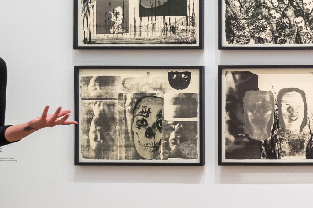
The artist Kiki Smith created a print series titled “Banshee Pearls” in 1991 in conjunction with a sculpture of the same name. The “Banshee Pearls” print series consists etchings and aquatints, characterized by their intricate, delicate lines and subtle tonal variations, which create a dreamlike, otherworldly atmosphere. Kiki Smith often explores femininity, mortality, and the natural world in her work.
Also on view is a significant work by the Austrian artist Hermann Nitsch. Despite its controversial reputation, “The Last Supper” is an important example of his explorations of the boundaries between art and ritual, spirituality and violence. Based on the story of the biblical last supper, the painting is dominated by a large, circular form that resembles a mandala or a sunburst. The figures of Jesus and his disciples are barely discernible within this central form, their bodies fragmented and distorted into a riot of lines and shapes.
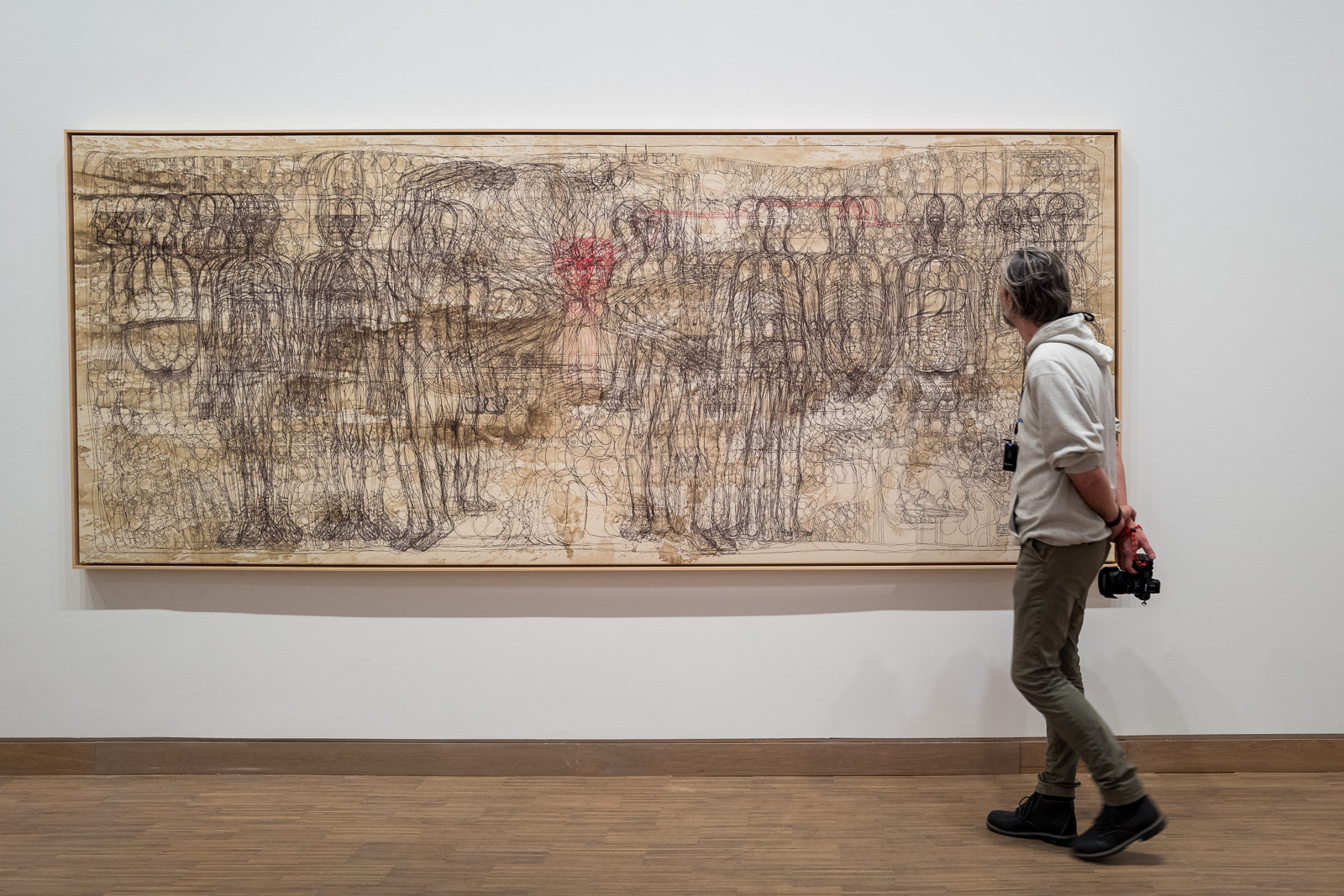
One artist who particularly stayed on my mind, because of the sheer amount of work involved in producing these very photographic seeming images, is the Swiss artist Franz Gertsch, who created intricate large-scale pointilist woodcuts. He used a technique called “woodcut painting,” which involves creating a woodcut of his subject, scanning it into a computer, and then printing the image onto a large canvas. He then painted on top of the print with acrylic paint, creating an incredibly detailed and realistic image.

For several of these artists, the print work was experimental and took many iterations to perfect. One of them is Chuck Close, with his close-up head portraits. Close’s portraits often depict himself, his friends, and fellow artists, and are usually created using a grid system. The end result are highly detailed and meticulous renderings of the human face, often including every pore, hair, and imperfection through a process of iterative prints. One of Close’s most famous printmaking techniques is the “reduction” method, where he creates a series plates, inks each separately and then prints them on top of each other to create the final image.

The exhibition also features some of the German artist Anselm Kiefer’s most significant and powerful bodies of work, from his 2013 series “The Ways of Worldly Wisdom”. In these dark, brooding images that he is known for, Kiefer references the philosophical concept of the “sapientia” or wisdom, and shows his interest in the intersection of science, religion, and mythology. Each painting is named after a different figure from history or mythology.

There is so much to see here, and I took way too many photos to show them all here. You can see a few more on my Instagram page, but better yet, I recommend going to the Albertina Modern and looking at it yourself!
I would like to thank the Albertina and Igersaustria and Igersvienna for inviting us to this guided tour!
This exhibition is on view from 24 February to 23 July 2023 at the ALBERTINA MODERN on Karlsplatz in Vienna.

All photos © Karin Svadlenak-Gomez
Sources: Albertina website, exhibition tour, web research

There is something powerful in having the same motif repeated in different colors, or with other variations. Without being able to print, it would have been a lot more challenging and boring for the artists to recreate the same picture over and over.
LikeLike
you’re quite right on that, Tanja!
LikeLiked by 1 person
Fantastic blog of a great exhibition!!!thank you Karin…makes me want to do another visit
LikeLike
thank you, Luis
LikeLike